Colour Psychology In Kitchen And Joinery Design
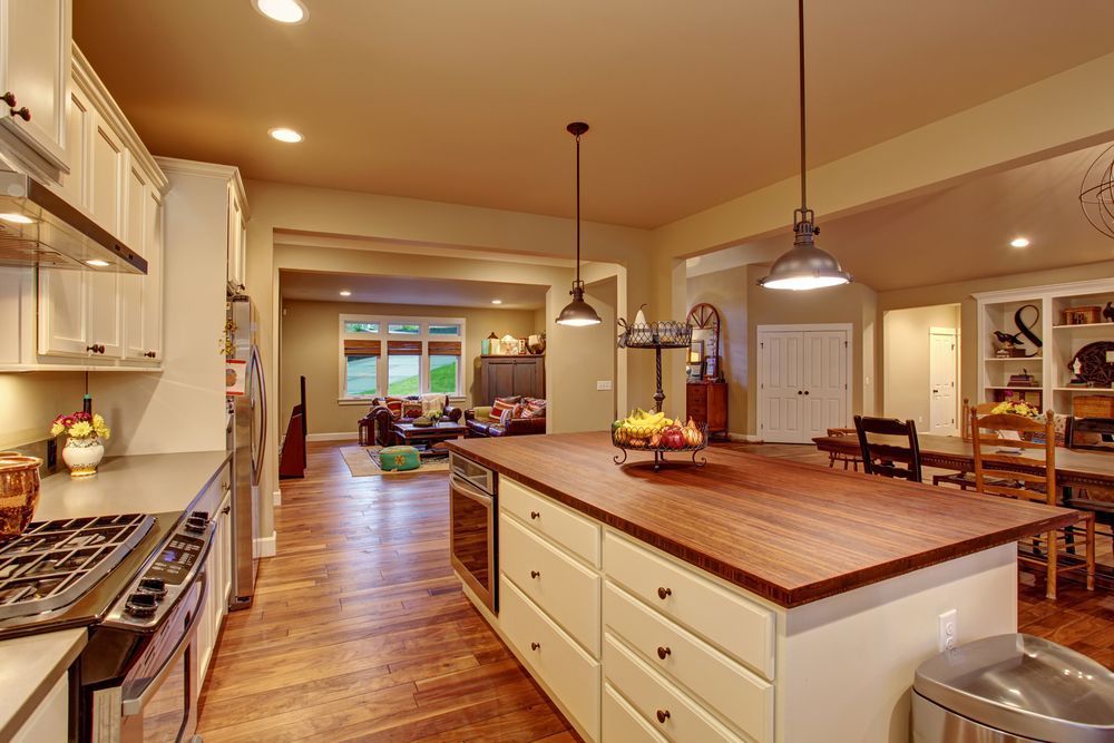
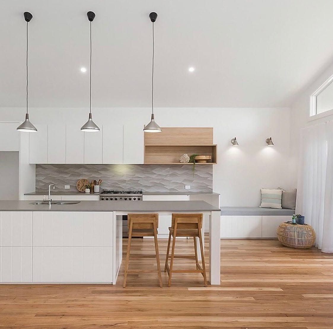
Stand in two kitchens with identical layouts and you'll walk away with two completely different feelings. One painted in soft warm tones might feel relaxed and welcoming, while the other, finished in cool greys, can feel sharp and clinical. The difference isn't the cabinetry or the appliances. It's colour. For anyone planning a
kitchen renovation in Newcastle, homeowners are increasingly discovering that the palette they choose shapes far more than appearances. It influences mood, how large or small a room feels and even how functional the space becomes day to day. Understanding this can turn a good kitchen into one that genuinely suits the way you live.
Why Colour Choices Matter More Than You Think
Colour is one of the first things we notice in a room, often before we register the layout or finishes. It sets an emotional tone that lingers every time you walk in, whether that's calm, energised or simply comfortable. For a kitchen renovation Newcastle families are undertaking,, colour decisions often get left until the end, when really they should be part of the earliest planning conversations.
A few reasons colour deserves attention from day one:
- It affects how welcoming or clinical a space feels
- It can highlight or hide architectural features
- It influences how clean and considered a room appears over time
- It plays into resale appeal down the track
Getting this right early avoids costly changes later and ensures every other decision, from benchtops to lighting, works with the palette rather than against it..
Warm Vs Cool Tones Setting The Mood In Your Kitchen
Warm tones such as terracotta, honey and soft timber hues tend to draw people in, making a kitchen feel like a natural gathering spot. Cool tones like blues, greens and greys create a calmer, more composed atmosphere, often suited to sleek or minimalist designs. Neither is right or wrong, it comes down to how you want the space to feel and function for your household.
Some common associations worth considering:
- Warm tones suit sociable, high-traffic kitchens
- Cool tones suit quieter, more streamlined spaces
- Neutral bases allow flexibility with accent colours
- Contrasting tones can define zones within an open-plan layout
Whether you're planning a full
kitchen renovation in Newcastle or simply refreshing your cabinetry, colour is one of the most powerful tools for shaping how a space feels..
Making A Small Kitchen Feel Bigger With Colour
Space perception is one of the more practical sides of colour psychology, and it's especially relevant in older homes with compact kitchen footprints. Lighter colours reflect more light and tend to push walls visually outward, while darker tones can make a room feel more enclosed, sometimes intentionally so. Reflective surfaces and strategic use of colour on joinery can also change how a room reads from the doorway.
A few techniques that help smaller kitchens feel more open:
- Light, cohesive colours on cabinetry and walls
- Glossy or satin finishes to bounce light around
- Minimal colour contrast between benchtops and splashbacks
- Vertical lines or panelling in lighter tones to draw the eye upward
These choices don't just make a kitchen look bigger, they make it easier to move through and work in.
Choosing Cabinetry And Joinery Finishes That Stand The Test Of Time
Trends come and go, but cabinetry is a long-term investment, so it pays to choose finishes that won't feel dated within a few years. Timeless doesn't mean plain. It means selecting tones and textures with enough depth and versatility to age gracefully alongside changing trends in hardware, lighting and decor. Our designers create custom kitchens Newcastle homeowners love, selecting palettes tailored to each room's light, layout and lifestyle.
Finishes that tend to hold their appeal over time:
- Muted, earthy tones rather than high-saturation colours
- Natural timber grains paired with simple hardware
- Matte finishes that soften harsh lighting
- Two-tone cabinetry that balances classic and contemporary elements
A well-chosen finish becomes the quiet backbone of the kitchen, supporting whatever styling changes come later.
How Light Transforms The Colours You Choose
The same paint swatch can look completely different depending on whether it's under morning sun, afternoon glare or artificial downlights. This is why colour decisions should never be made from a small sample alone. Orientation, window size and even nearby reflective surfaces such as benchtops all shift how a colour reads throughout the day.
Factors that influence how colour performs in real light:
- North-facing kitchens tend to suit cooler tones better
- South-facing spaces often benefit from warmer palettes to offset lower light
- Artificial lighting temperature can shift undertones significantly
- Testing swatches at different times of day avoids surprises post-install
Your colour scheme should also work with your chosen benchtop materials, so surfaces and tones complement rather than compete with one another, as outlined in our
guide to kitchen benchtop materials..
Matching Your Palette To Your Lifestyle
A young family with kids constantly in and out of the kitchen has very different practical needs to a couple who entertain often or a retiree seeking a calm, low-maintenance space. Lifestyle should guide colour just as much as personal taste, particularly when it comes to durability and how forgiving certain tones are with daily wear.
Lifestyle factors worth weighing up:
- Busy households often benefit from mid-tone colours that hide marks
- Entertainers may lean toward bold accents for visual interest
- Low-maintenance living suits simpler, tonal palettes
- Multi-generational homes benefit from neutral bases with flexible accents
When colour is matched to how you actually use the space, the kitchen works harder for you, not just for photographs.
The Designer's Approach To Selecting Your Colour Scheme
Professional designers rarely choose colour in isolation. They consider the home's existing architecture, the flow between rooms and how the kitchen will be used day to day before a single swatch is finalised. This process blends technical knowledge of light and materials with a genuine understanding of the household's habits and preferences.
A considered design process typically includes:
- Assessing natural light and room orientation
- Reviewing adjoining living spaces for colour continuity
- Testing samples against benchtop and splashback materials
- Balancing personal taste with long-term resale considerations
This structured approach removes the guesswork, helping avoid costly changes of heart mid-project..
Frequently Asked Questions
Many homeowners have similar questions once they start thinking seriously about colour in their kitchen design.
Common questions include:
Does kitchen colour really affect how a room feels day to day?
Yes, colour has a measurable impact on mood and how spacious or cosy a room feels
Should I choose colour before or after selecting benchtops?
Ideally both are considered together so tones and materials complement each other
Can dark cabinetry work in a small kitchen?
It can, provided lighting and layout are carefully planned to avoid the space feeling closed in
How many colours should a kitchen have?
Most successful kitchens use two to three core tones, with additional accents kept minimal
Start Your Colour Journey With Inovative Interiors
We at
Inovative Interiors understand that choosing the right palette is one of the more overwhelming parts of any renovation, and it's a decision we love guiding our clients through. From assessing natural light to pairing tones with benchtops and joinery finishes, we take a considered approach that reflects how you actually live in your home. If you're in Newcastle, Lake Macquarie, Maitland or the surrounding areas and ready to start planning your next kitchen project, we'd love to hear from you. Visit our Cardiff showroom or
get in touch today to book a consultation and discuss the colours, finishes and layout that suit your space best.